





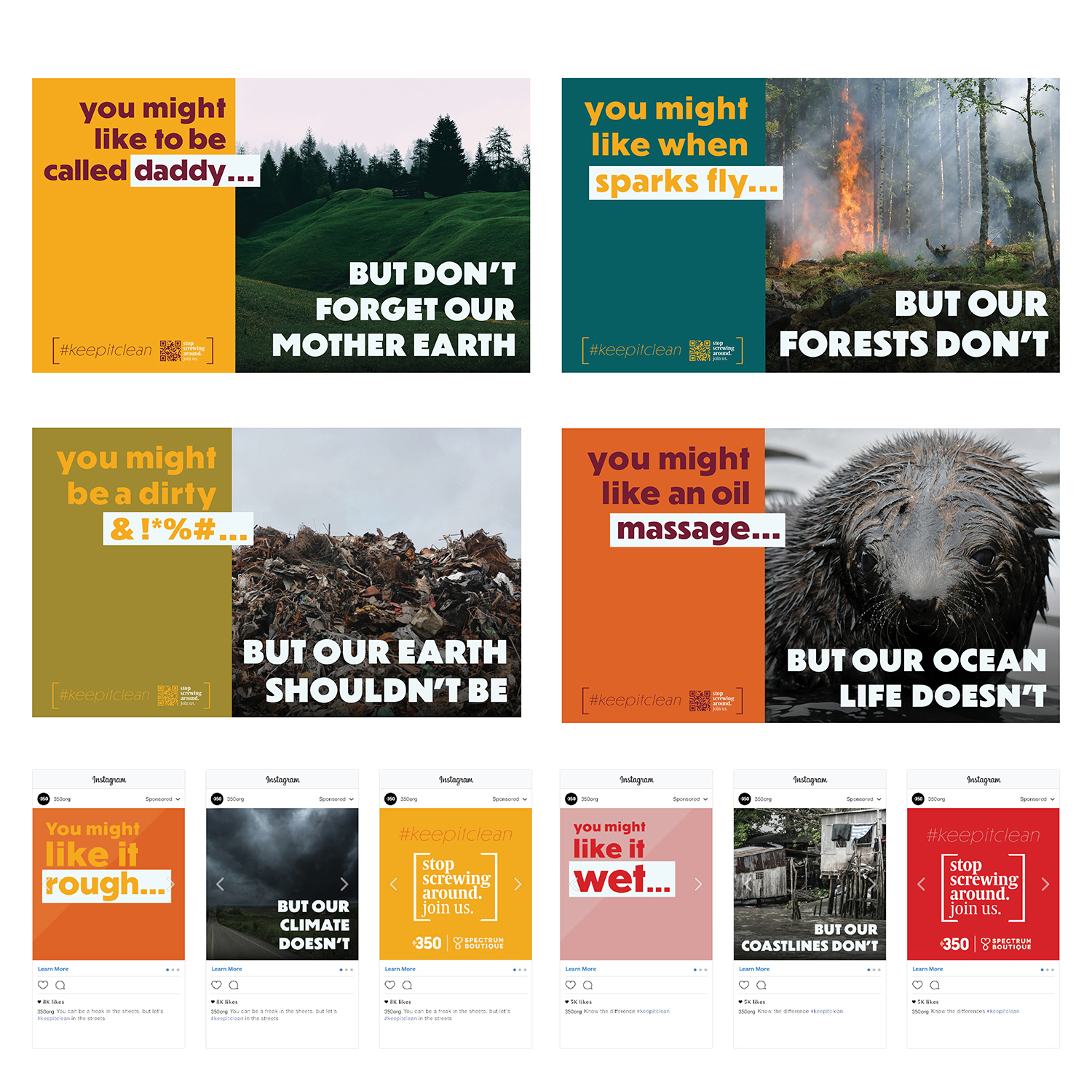
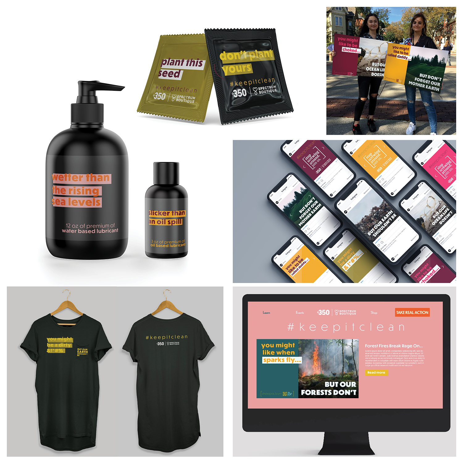
350 is a “bold, creative and strategic organization that embraces new experiments and solutions, recognizing that [the climate] crisis requires new ways of solving problems.” 350’s new campaign will prove a fresh approach can take on the challenge of shifting the mindset from fearful or desensitized.
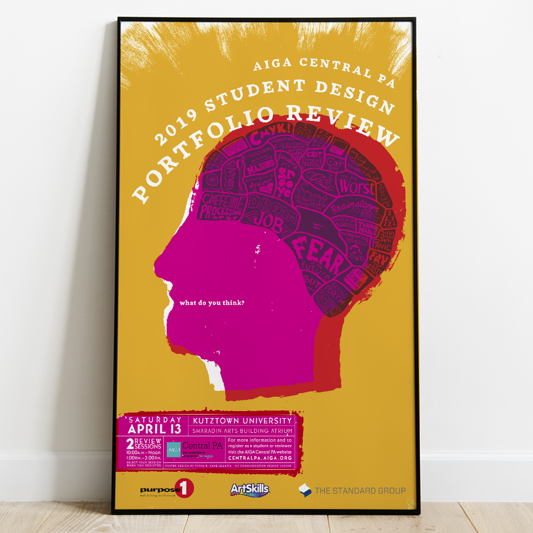
Photo frames mockup
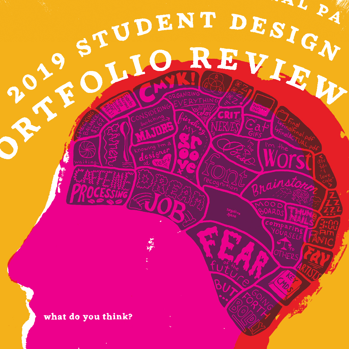
This event branding reflects the tension students face between what they think internally about their work and how they approach criticism. The reference to old-fashioned phrenology is modernized by vibrant colors and simplified imagery. A stamping process and hand-drawn typography emphasizes the intimate and frenetic energy of the portfolio review experience.

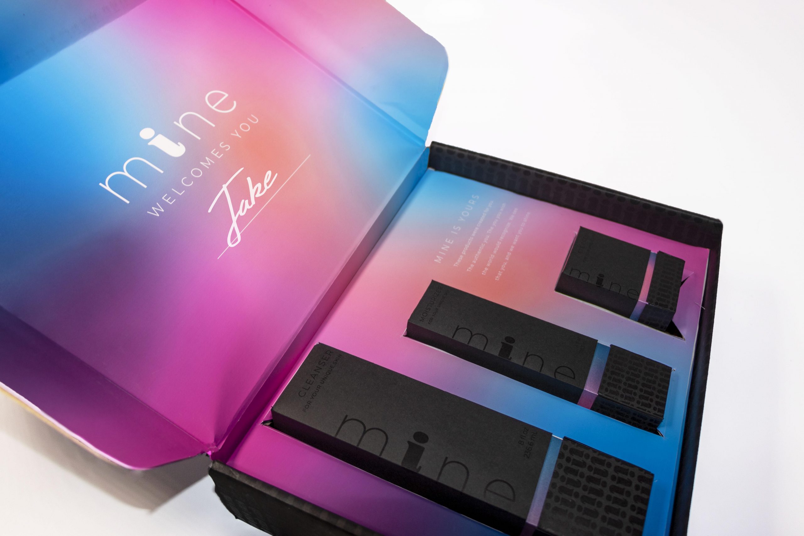
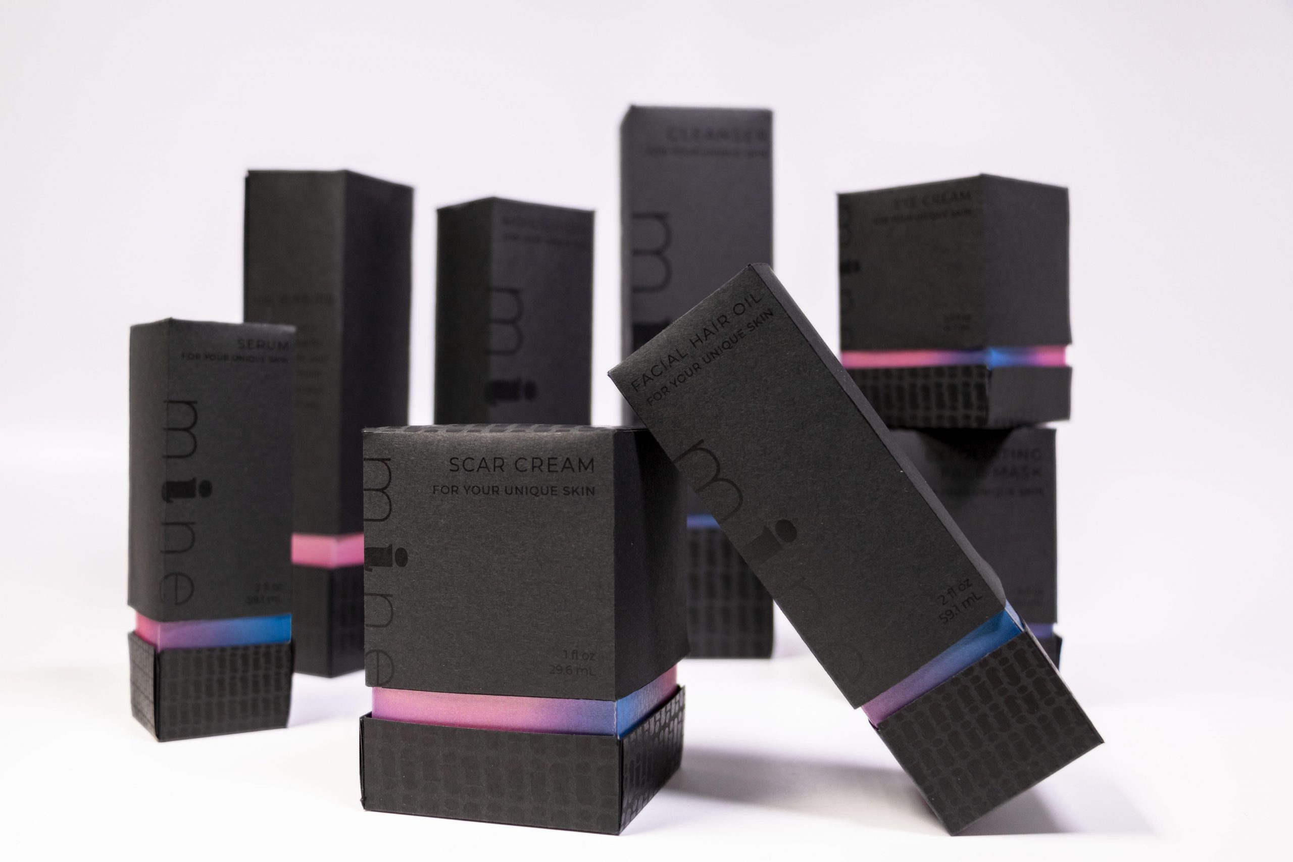
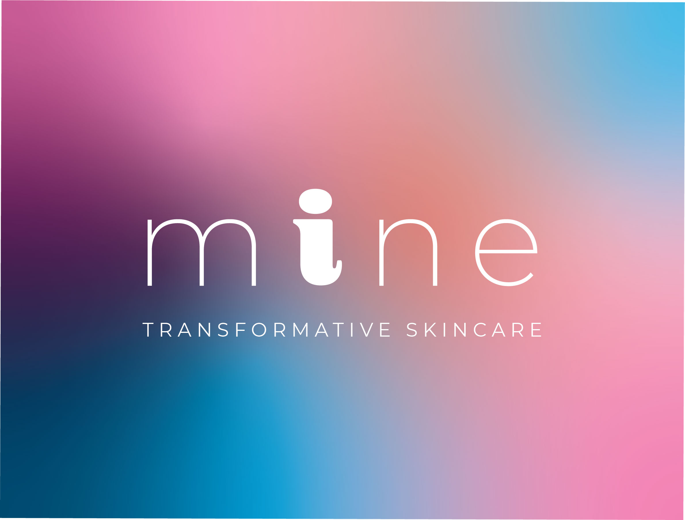
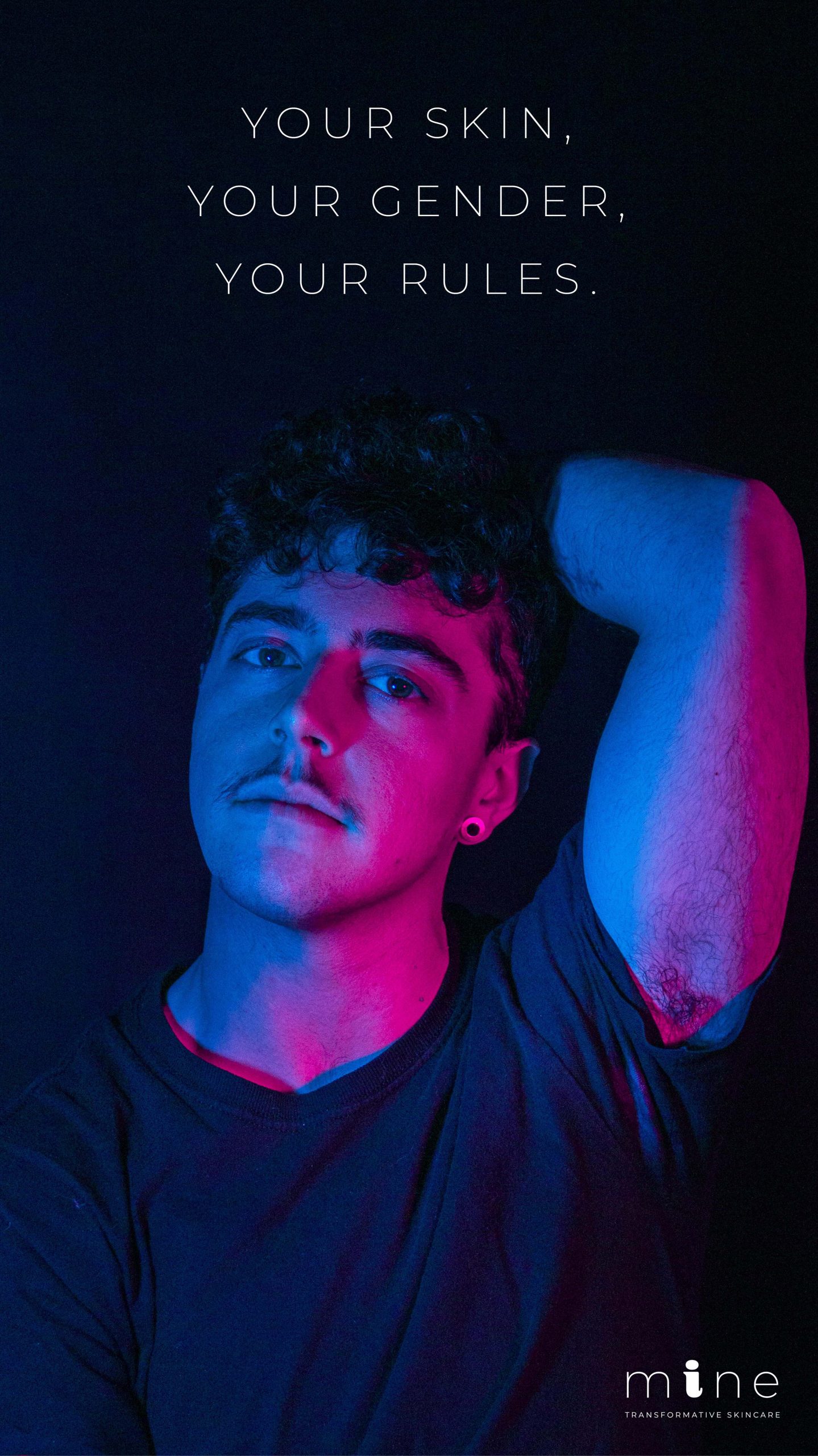

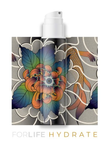
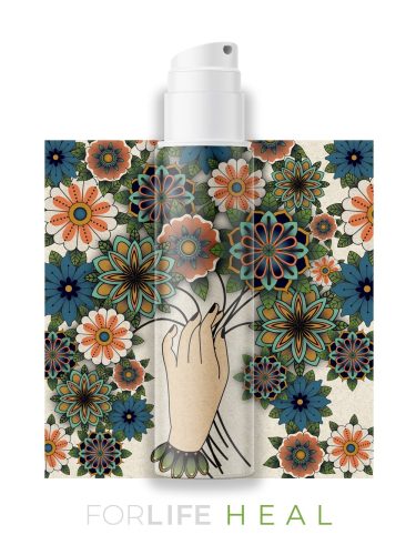
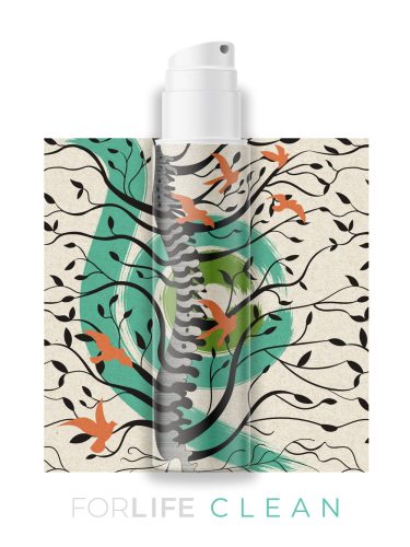
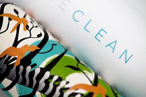
Transitioning from one gender to another is uncharted territory for most of us. We are content to conform to the gender we were assigned at birth and operate under the norms attributed to it. For transgender people however, navigating gendered norms is a little more complicated. To help alleviate the stress that can come with exploring and expressing gender identity, I designed a subscription skincare service tailored to a transgender audience. As a part of this project, I created a brand identity with a distinctive logo, a meaningful color palette, and gender-neutral copywriting. I also designed packaging, a series of ads, and a brand guide/view book to capture the core nature of the brand and how it should be implemented. By addressing trans people’s concerns for both their skin and their identity, we can gain a deeper understanding of how someone may transition into a more authentic self and how the skincare industry and the design industry can make it easier.
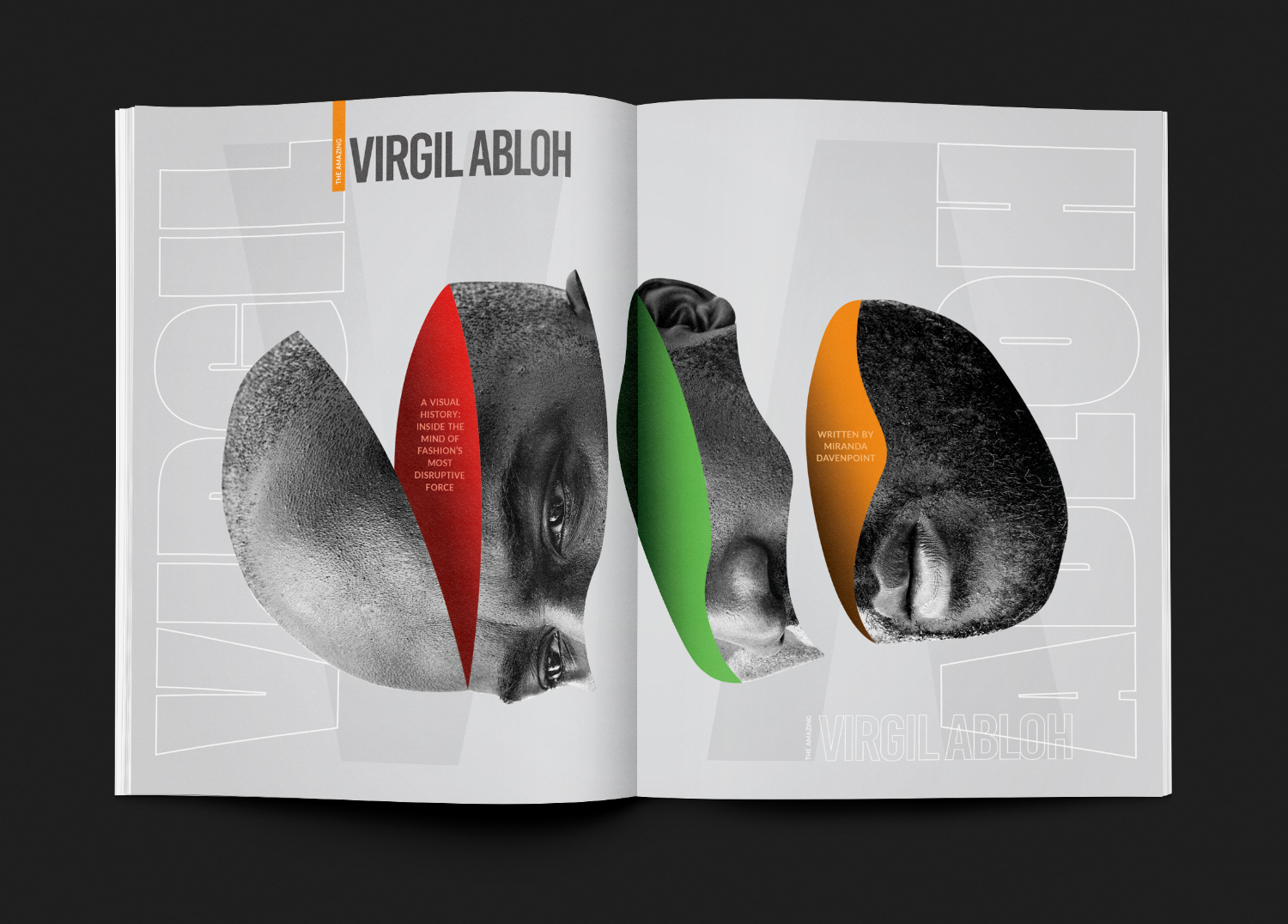
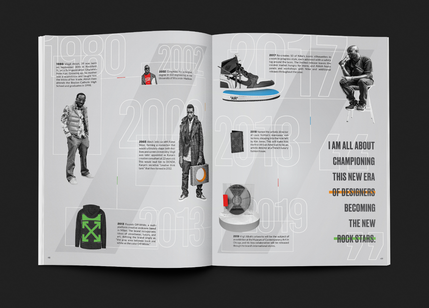
The Society of Publication Designers is dedicated to promoting and encouraging excellence in editorial design.
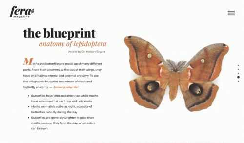
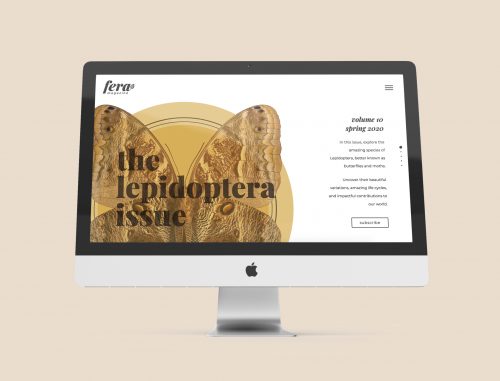



The Society of Publication Designers is dedicated to promoting and encouraging excellence in editorial design.
You must be logged in to post a comment.