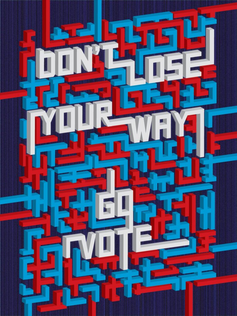
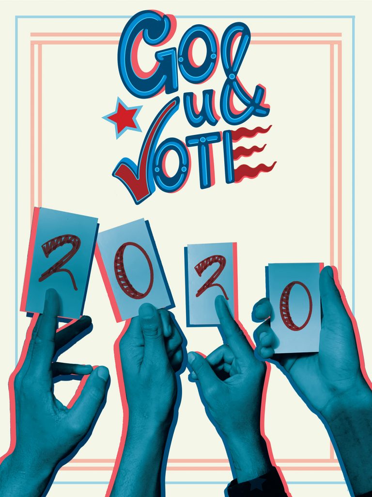
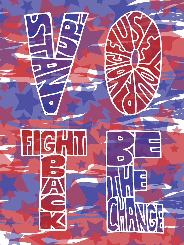
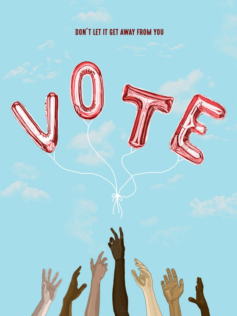
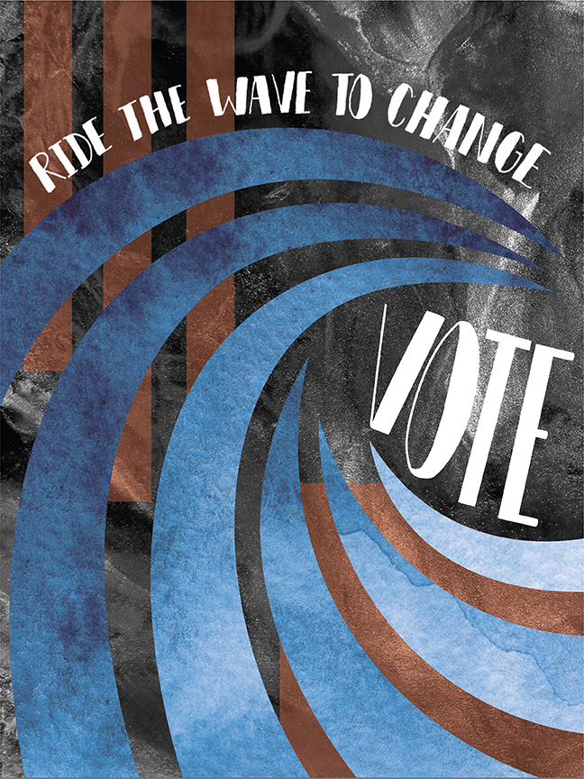
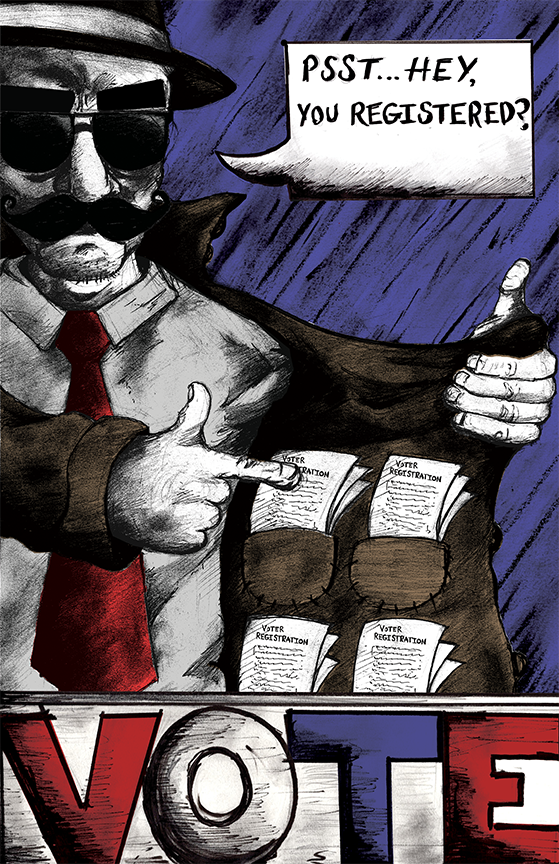
Communication Design Senior Poster Workshop
On view in the Sharadin Art Building Atrium
October 26–November 8, 2020
Open to the public
On view in the Sharadin Art Building Atrium
October 26–November 8, 2020
Open to the public


In my first years of college, I took ROTC, in those days mandatory for male students at Land Grant institutions. I recall the marching drills and inspections we had every Tuesday at noon on the parade field. There was tension in the air as we walked, lockstep, within perfectly aligned ranks. And then we presented for inspection or rifles, old M-1’s from the Second World War. In addition, pants had to be pressed, shoes shined, and collar brass gleaming in the noonday sun.
But then, when all this pageantry was nearly over, our company commander would shout, “At ease!” What a relief…we could relax a bit, standing without the stiff tension of marching or being inspected.
Before I came into teaching, the design office for which I worked billed at different hourly rates depending upon the function’s degree of mental or emotional tension…a higher dollar figure for client contact, creative thinking, copywriting, and design, and a lower figure for doing comps and mechanicals. After wracking my brain to come up with an idea and a tense meeting to sell the client, I used to enjoy the relatively relaxing work of a traditional mechanical. But, with today’s Macintosh-based work, there’s a merging of various design and production duties and less distinction between “Attention” and “At ease.”
I will admit, though, when compared to the front lines of client contact or intense creative thinking’s earshot range of constant enemy fire, sitting at the Mac, while not exactly rest and relaxation, lets me lean back and see how the war is going, and provides chances to undo bad battlefield decisions I may’ve made.
-John K. Landis
Excellence.
I’ve mused how the lowly pencil can be revealing of what kind of quality its user produces. If the pencil gets sharpened shorter and shorter while the eraser stays long and square, it means the user doesn’t have many mistakes to correct. While, of course, a pencil that’s still too long, yet has its eraser worn down to nothing would imply very little is produced before it must be corrected by erasing!
I’ve often told my Communication Design seniors, about to embark upon their professional careers, that there’ll not always be immediate supervisors who’ll control their accuracy and quality: they’ll be their own quality control. Add the pressure many jobs have to work quickly, and you often have a climate that bends toward compromising the accuracy and quality in order to get the job done fast. And, think about the education profession where there’s much autonomy and the product is only as good as the chooses to make it each year.
The Japanese, who learned U.S. lessons about quality control after the Second World War, find that workers favorably identifying with the product they produce can help immeasurably to create an accurate and quality item with zero defects. We in art professions should have little difficulty identifying with our products!
Ah, speed and accuracy. Good goals to attain whether you’re on the pit crew at Indy or in the bullpen in Philly. Strive to have your pencils get short while their erasers stay long.
The Old School Tie

Rich Tu is a first generation Filipino-American and award-winning artist residing in Brooklyn, NY. He is the Vice President of Digital Design for MTV, VH1, CMT, and Logo at ViacomCBS. On Thursday October 15th, he spoke to Kutztown students about his work and the creative industry. Rich reminded us all “don’t forget the stuff that you love” while sharing his sneaker collection, basketball knowledge, and long-time love for music and pop culture. He lets his personal work get rebuilt and recycled into professional projects and works on what he loves. Rich was incredibly generous with his time and allowed students to ask questions about his creative process and work with clients in the industry. Overall, it was a great night filled with genuine kindness and endless passion for art and design.
Watch the recording:https://kutztown.zoom.us/rec/share/lrnf0T1kcnqBNKjTODJI1KDqa80aL31lchLa4nsJG7imkAezb7vNtYAgTxxUUCJK.efZQ9RLSNhEBkMuu

A real transition is in the making for me. This is the first issue of By Design ever created on a Macintosh. Letting go of the traditional ways is not easy, so I’ve created only the body copy on the Mac. I know PageMaker the best; and I’m not sufficiently satisfied with my abilities to control kerning on the screen, so I’ve still reverted back to setting heads in Stymie Bold on our Varityper Comp/Set 3510.
In starting my current Production Processes class on a desktop publishing assignment after ten full weeks of traditional mechanicals with T-square, triangle, and X-acto, I asked them to philosophically discuss several statements about computers and art. One statement said “It is important to learn to design (and do production) by traditional means first, before you work on computers.”
Everyone agreed.
Now, a few philosophical questions for you…Psychologists tells us that the more we get high tech, the more we need high touch. Should students set “foundry type” (simulating the way metal type used to set up) the cut it up by X-acto to kern and improve letterfit before they manipulate it electronically on a computer screen? I think the answer is “yes.” I adopted this assignment, developed by David Bullock, for the first time last fall in my own Typography class. Can the beginning student in the graphic arts “get the feel” of type without ever touching individual letters…like indicating them on a rough or tight comp? Perhaps not. Can you proofread copy on the screen as easily as printing out and reading a hard copy? I know I cannot. Will my production classes always do some assignments by T-square and triangle before moving to electronic means? Yes, most likely.
The more I feel comfortable with this additive new medium, the more I will convert some aspects of my own design work to it. But, I’m still going to do some work by traditional means both now and (probably…) in the future. I like touching artwork; and I’ll always make sure my students have the opportunity to do it, too.
-John K. Landis
Art Educators listen to guest speakers as part of Dr. Julia Hovanec’s course; Extending Literacy: Visual Thinking & Learning in Art & Beyond Workshop at Sharadin Art Building, July 18, 2019.
A few months ago, I had a particularly bad case of twenty-four-hour virus…you know, the kind during which you feel so vile you can’t understand why you don’t just die. In my dark mood I visualized my death, a small headline in a local paper “K. U. prof dies suddenly,” but I especially reflected upon everything that would be left undone if I really did die…
The lunch dishes weren’t washed. They lay strewn about the kitchen, too far from the sink full of soapy water to keep food from hardening on plate and pot and making it doubly difficult for my survivor to clean. There was a manuscript for a magazine article in my typewriter; the power was on and the carriage was even set at an indent tab, waiting for the beginning of my next paragraph which would never come. I was on sabbatical and taking nine graduate credits. Three professors would wonder what happened to me—I’d be a phantom to them, like I call some of my undergraduate students when they just disappear from class. A blister-pack cassette able for my specialty audio producer client in Washington would be deserted midway through production. My wife, nineteen-year-old daughter, and thirteen-year-old son would have to divide up chores of collecting trash, bringing in mail, and replacing a dead smoke detector battery. The family dog would not even have his late afternoon ball throw that he lives for each day. My life was a series of works, however humble, in the process of progressing towards goals.
I’ve been particularly conscious of the process of art as opposed to the finished product. When I returned from sabbatical, I began teaching a course in Visual Thinking, during which finished products are minimal or nil, but the successful process of how to think is the goal.
Life is a continuing process: a trying, doing, striving, failing, succeeding. As sorry as I felt for Olympics participants who traveled all that distance to end up in 32nd place, having made the Olympic team should’ve been enough (yes, I know, try telling the 4th place finisher that!). But perhaps more important was just the fact that they participated in the sport of Alpine skiing or luge or boxing or swimming.
Once in a while, back off from believing you are judged by your achievements. The very word implies a conclusion, a finality. Enjoy the process along the way. The greed of today often suggests we should achieve the goal by any means possible; but remember the legendary advice that it’s far better to compete, getting dusty and bloodied in the arena, and lose the contest, than to sit in the stands and watch.
I guess it’s evident that I recovered. There was no obit, the article got typed, I finished my courses and even the dishes. But I decided when I do go through the pearly gates, it’s going to be at speed. I want to be make blurred action on the negative so that you’d have to set your camera at a high shutter speed to stop me. I want to be fully involved in the process of whatever I’m doing, and that’ll make my life a successful product.
-John K. Landis

The high tech laser printer wouldn’t put any image whatsoever on the left end of a #10 envelope, even though the second semester senior ran it through time and again.
Everything on the screen showed all systems normal…positioning was well within live area, the envelope was fed into the right tray properly and a new bottle of toner awaited whatever images would be demanded.
So, he came to me, first asking if I knew what was wrong (no, I didn’t even know laser printers could print on converted envelopes without jamming), and if I knew of any other place that could print his self-promo logo on the end of an envelope, one for this Wednesday’s class an about 49 others for use in resume mailings for a job search.
Several calls to trusted service bureaus produced nothing. Screen process printing was a considered option (he had Serigraphy this semester), but we both knew nine point type would plug the screen after just three or four prints. Photocopying on a piece similar colored paper to be pieced on seemed…well, pieced on.
And, he just wouldn’t go away. It was as if he sensed I had some solution I hadn’t yet given him. It was one of those times I just wished I could hear the successful bottom line to the problem in a few weeks when I’d be looking at a handsome comp and hearing how he had resolved it on his own and learned a tremendous amount in doing so.
Finally, a light came on in my brain when he said he needed that small production run in addition to the supercomp. Letterpress—the oldest form of printing, whereby a raised, backward-reading plate can print on a smooth surface—sounded like a solution. I sent him to an Allentown printer who still ran letterpress jobs on an ancient platen press. Custom photoengraving, a zinc plate mounted type-high on a block of pine, could lay its image on the envelopes, one for supercomp needed in class, and 49 others to invest in job-getting. And, letterpress would make a reasonably low unit cost for the very small printing run.
The moral of the story…? Sometimes you need to know when to pick up a pencil or an X-Acto knife instead of a mouse. And, as a late 20th Century visual problem solver, you sometimes need to step back 100 years instead of the usual and expected forward.
-John K. Landis


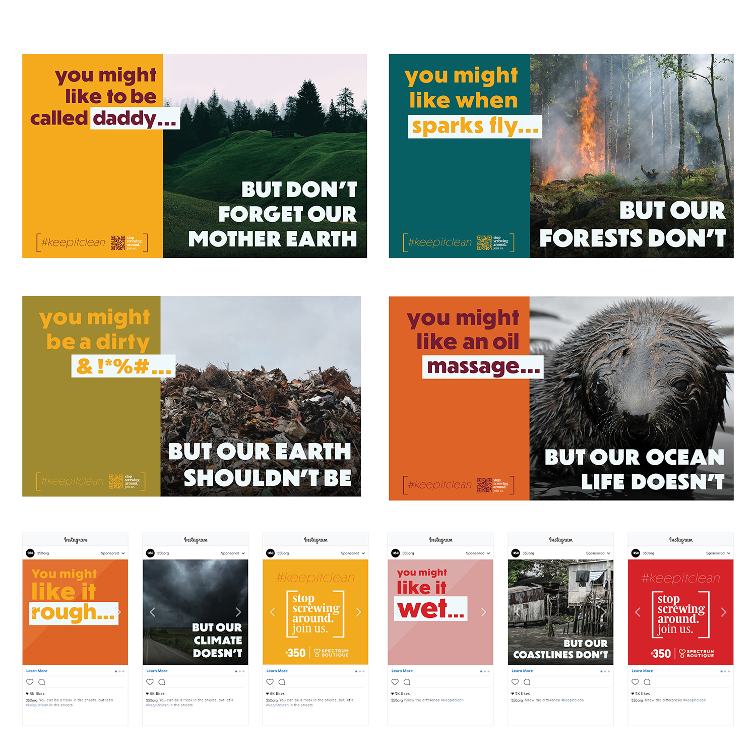
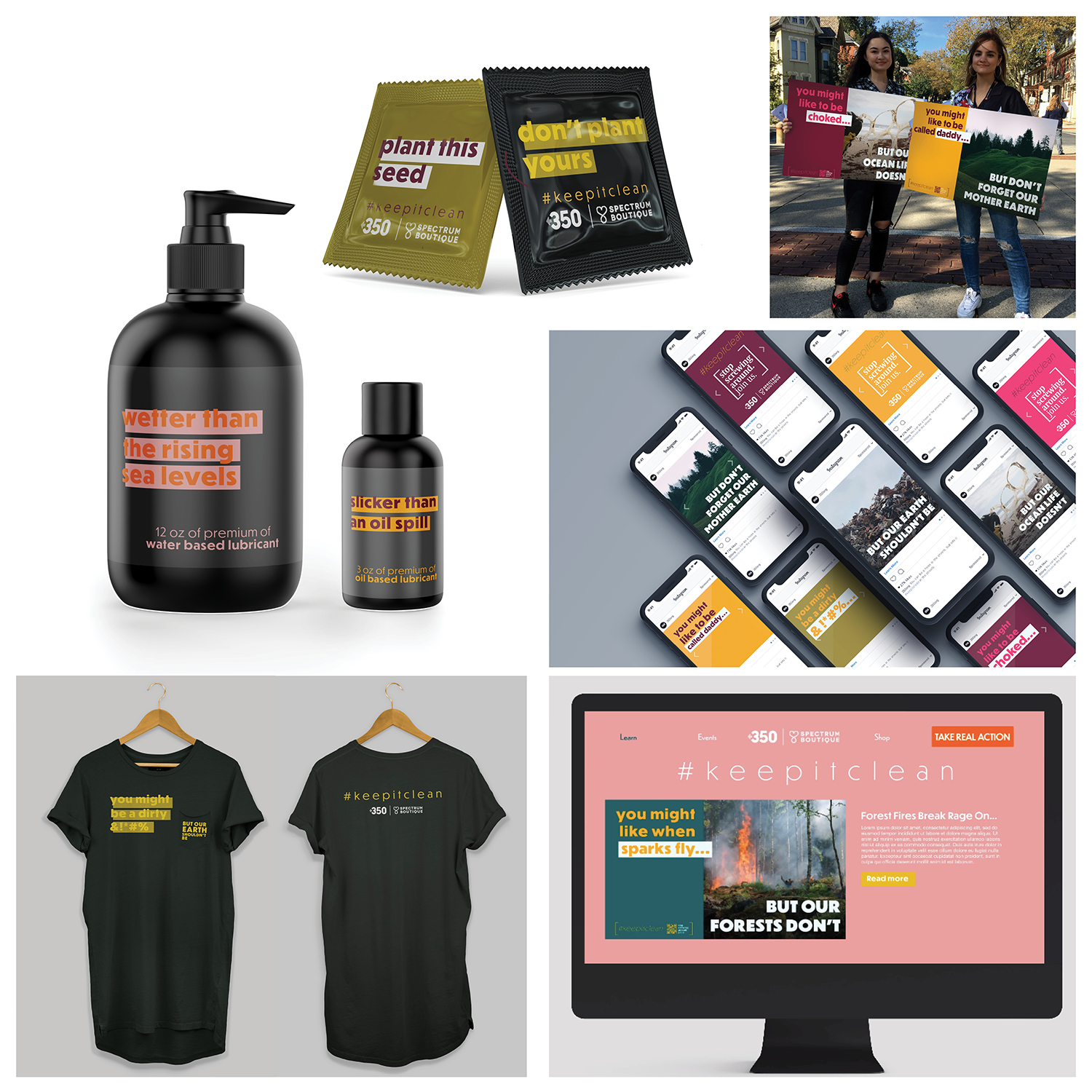
350 is a “bold, creative and strategic organization that embraces new experiments and solutions, recognizing that [the climate] crisis requires new ways of solving problems.” 350’s new campaign will prove a fresh approach can take on the challenge of shifting the mindset from fearful or desensitized.
 15200 Kutztown Rd.

You must be logged in to post a comment.