Print Peppermint
I have been teaching at KU for more than 17 years. One class that i have consistently taught has been Print Media Production. Anyone that has taken that class with me can attest to my LOVE of paper, ink and all things printed. I could spend hours geeking out over paper, fawning over different print processes and fan-girling over printed special effects.
When I worked full time as an Art Director, my favorite part of the job was going on a press check. The point in the project when the final design is complete, approved by the client and the next step is to copy it thousands or even millions of times for the world to see. The smell of fresh ink, the rhythmic sound of the offset press, the cool mist in the air to keep the paper at the perfect humidity and the repetitive output of the design that you created as it piles up at the end of the press is an intoxicating experience.
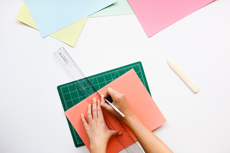
I think the real reason I love to teach PMP is it give me a reason to hoard paper samples, printed promotions and beautiful examples of printed materials. The only thing better than collecting paper goodness is sharing paper goodness. Exciting and inspiring students by sitting around a table passing dozens of paper treasures, while explaining the intricacies of texture and the magic of special effects such as metallic ink and spot varnish is a hallmark of my course. I think the magic happens when the students can touch and feel the paper and examine the processes up close.
In the world of COVID, I was struck with a dilemma on how to teach this class online in a way that would continue to foster the love of paper an ink. Without the hands-on component, the information may be boring or at best a bit cold and detached. I began to reach out to paper companies and printers and asked them to send samples to support student learning and engagement. I was overjoyed when boxes of paper swatch books and printed samples started to arrive at my home.
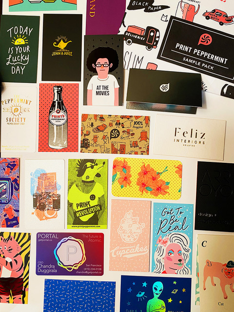
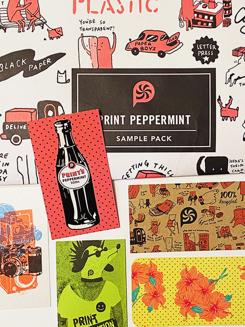
While searching the web for printers that would be willing to send samples. I came across Print Peppermint, a fun online print service with quirky illustrations as part of their brand. I sent an email with the request and quickly got a response from the founder Austin Terrill. Austin offered not only to send a multitude of printed samples but also provided a link to their online videos and offered to be a guest lecturer for the class.
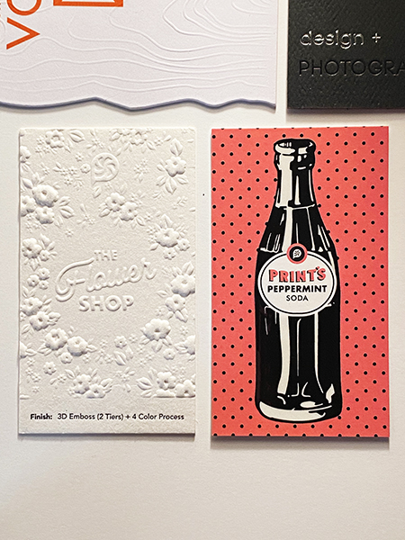
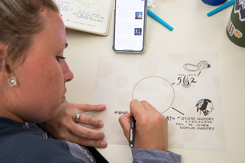
I was super excited that the printing gods heard my call and led my web browser to Print Peppermint. Austin hooked me up with a teacher sample pack and provided almost 200 samples for me to share with students in the class. When the samples arrived at my house, I was almost giddy reviewing the high-quality assortment of paper treasure. The samples included various paper stocks, finishes, effects and printing techniques. They ranged from professional and polished to fun and funky. I could not wait to get the samples in the hands of the students.
Very happy to report that with the help of Print Peppermint and other vendors, I was able to provide individual packs of print media morsels to each and every student enrolled in my class for the “rona” semester. Although the zoom classes are not ideal, the students still got to experience the tactile qualities of premium paper and dazzling special effects. They discovered the beauty of a rosette pattern under a printer’s loupe and transformed a sheet of paper into a 16-page booklet with only a couple of folds. Whether we are face to face in a classroom or socially distant because of a global pandemic, I hope that my love of ink and paper offsets to my students and gives them new appreciation for the beautiful world of print.
Looking for a truly great print partner who loves ink and paper as much as I do? check out printpeppermint.com
-By Vicki Meloney


You must be logged in to post a comment.